News
Camp 2026
Warum dieses Camp anders ist: Was Spieler im Sommer 2026 in Riga erwartet
Zwölf intensive Tage unter NHL- und Nationalmannschafts-Coaches – das macht das Camp 2026 einzigartig.
📅 04. Mai 2026
→
Camp-Start
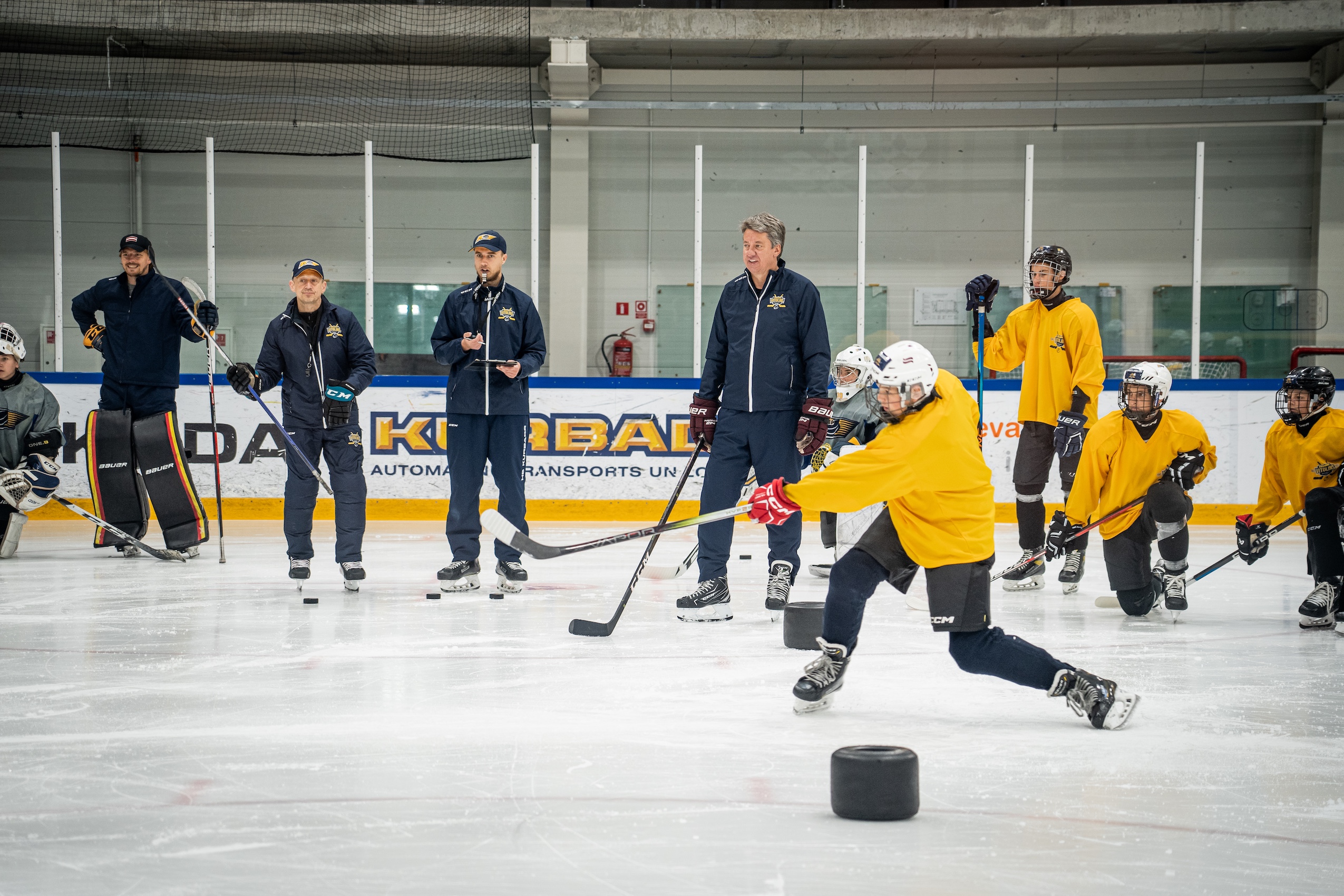
Countdown läuft: Das Hockey Camp 2026 startet am 20. Juli in Riga
Vom 20. bis 31. Juli wird die Kurbads Eishalle zum Trainingszentrum für junge Talente aus ganz Europa.
📅 02. Mai 2026
→
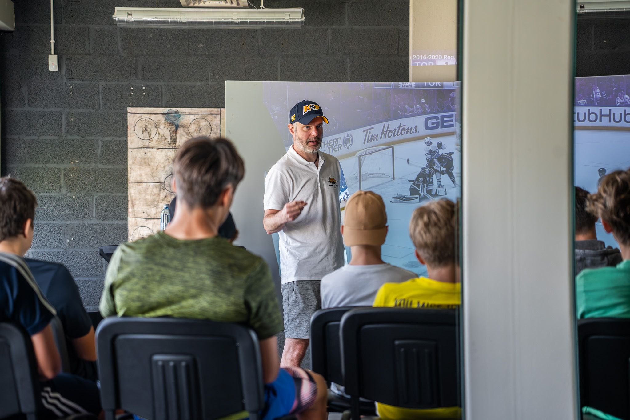
Trainerteam
Kaspars Daugaviņš verstärkt das Trainerteam als Special Guest Coach
98 NHL-Spiele, AHL-Champion und langjähriger Captain Lettlands – ein Ausnahmespieler kommt nach Riga.
📅 28. April 2026
→
Spielkonzept
Modernes Eishockey lernen: Das Spielkonzept des Camps 2026
Schnelles Umschaltspiel, intelligente Raumaufteilung und situatives Entscheiden auf internationalem Niveau.
📅 22. April 2026
→
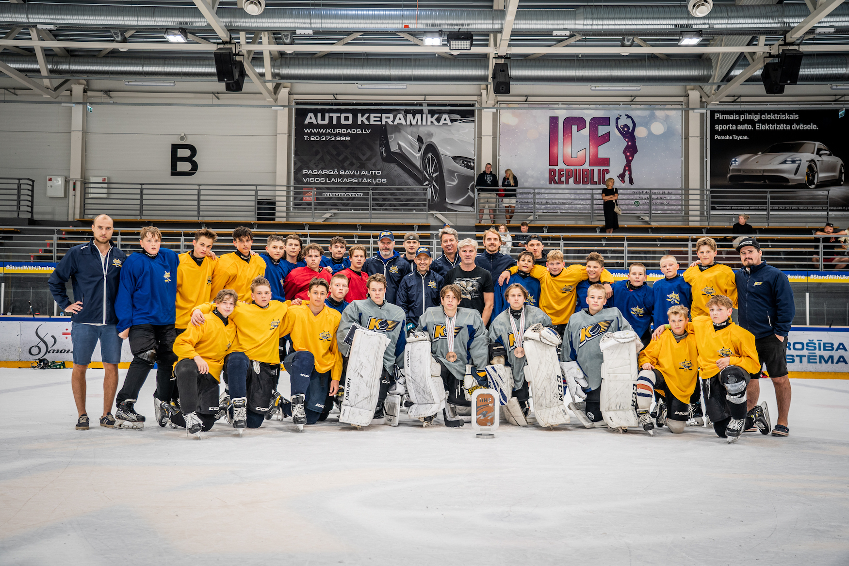
Teambuilding
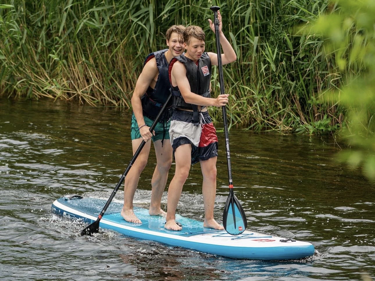
Mehr als Eishockey: Teambuilding auf dem Fluss begeistert Camp-Teilnehmer
Standup-Paddling in der lettischen Natur – das Highlight 2025 und fester Programmpunkt für 2026.
📅 15. April 2026
→
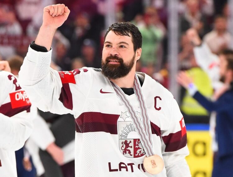
Lettland
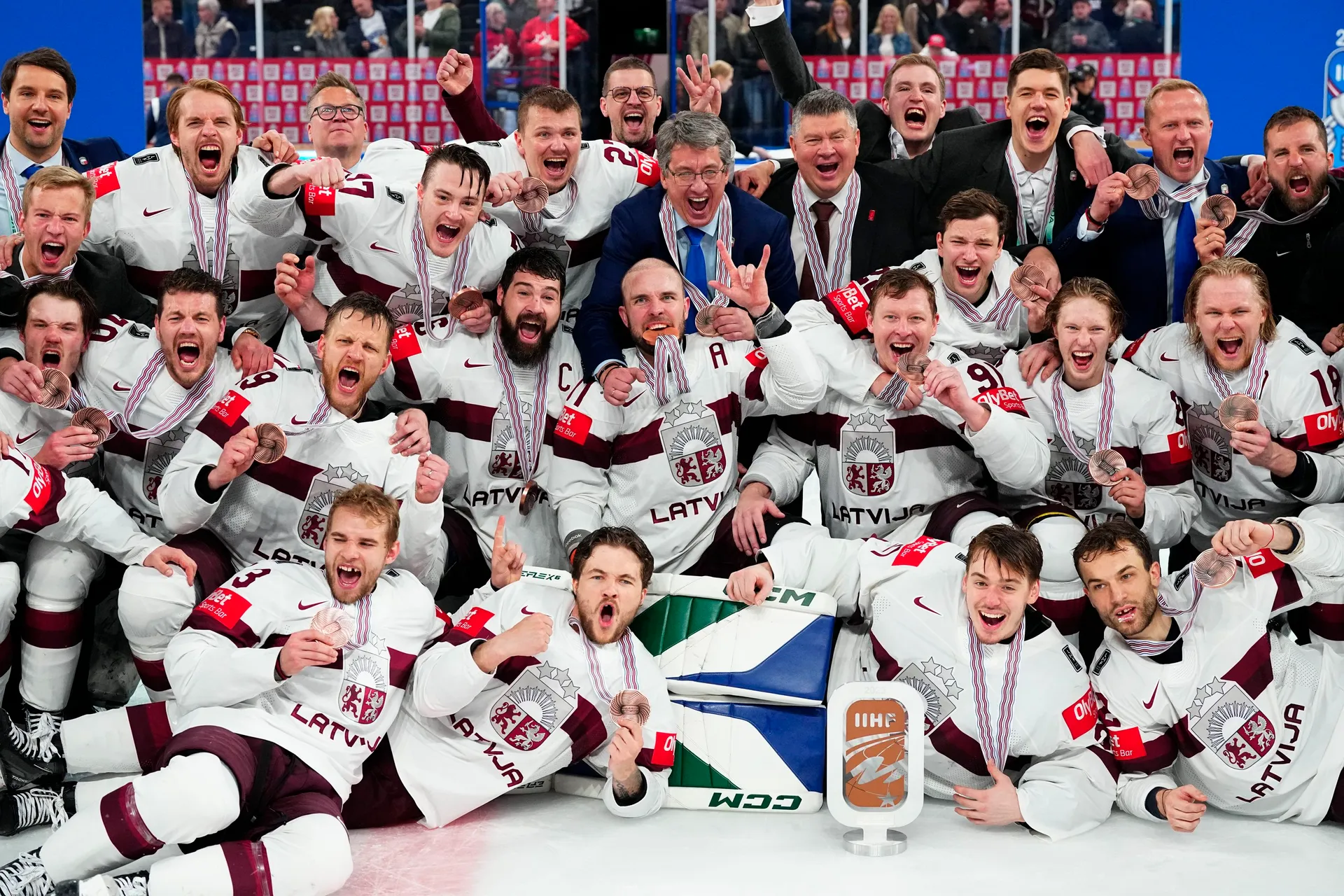
Historisch: Lettland holt WM-Bronze im eigenen Land
4:3 nach Verlängerung gegen die USA – die erste WM-Medaille der lettischen Eishockey-Geschichte.
📅 10. April 2026
→